
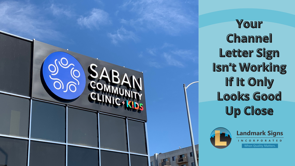
Your Channel Letter Sign Isn’t Working If It Only Looks Good Up Close
There’s a version of a Channel Letter Sign that looks great when you’re standing right in front of it.
The letters are clean, the logo is correct, and everything feels sharp and well put together. From that distance, it’s easy to assume the sign is doing exactly what it’s supposed to do.
But that’s not actually how most people experience your sign.
They’re not standing underneath it, taking their time to study the details. More often, they’re driving by, pulling into a center, or scanning the buildings around them trying to figure out where they need to go. They’re seeing your sign quickly, from a distance, and usually while they’re in motion.
So if your Channel Letter Sign only looks good up close, it’s missing the moment that actually matters. Because the real test isn’t what it looks like from ten feet away. It’s how it performs from the road.
Why Isn't Your Channel Letter Sign Working?

When a Channel Letter Sign isn’t performing the way it should, the issue usually isn’t obvious at first. Up close, most signs can pass. The lighting looks fine, the finish looks clean, and everything feels complete.
It’s only when you step back that things start to change.
Letters that felt bold begin to lose their presence. The sign starts to blend in rather than stand apart, and instead of catching your attention, it becomes something you have to look for.
The best Channel Letter Signs hold their presence as you move away. They stay easy to read from a distance, maintain clear contrast against the building, and continue to stand out even when you’re not looking directly at them. You don’t have to search for them, they register almost immediately.
In some cases, the scale just isn’t quite right for the space, so the sign feels smaller than it should once you’re viewing it from a distance. In others, the lighting is technically there, but it doesn’t carry far enough to maintain clarity beyond close range.
This becomes even more noticeable during the times that matter most. In Los Angeles, especially during the winter months, it gets dark earlier right as people are heading home, running errands, or deciding where to stop. That means your sign is being viewed at a distance, in motion, and in lower light all at once.
If it only works up close, it’s very easy to miss entirely.

What is a Channel Letter Sign Supposed to do for My Business?
A Channel Letter Sign is often thought of as a branding element, and it does play that role. But in practice, it’s much more functional than people realize.
At its core, your sign is there to help people recognize and locate your business without effort. It should be readable from a distance, easy to understand at a glance, and consistent in how it represents your brand across different conditions.
Unlike signage that’s meant to be experienced up close, Channel Letter Signs are usually viewed from farther away and at a variety of angles. That means they have to work a little harder. They need to hold their clarity not just when someone is standing in front of them, but when someone is approaching from across a parking lot or driving by at speed.
If a sign only works in one specific viewing condition, it’s not really working in the way it’s intended to.

Does a Channel Letter Sign Really Affect the Perception of My Business?
It does, and often in ways that aren’t immediately obvious.
People don’t consciously analyze signage, but they do respond to it. If a sign is difficult to read from the road or doesn’t stand out clearly, it creates a subtle sense that something is off. The business might feel less visible, less established, or simply easier to overlook.
On the other hand, when a Channel Letter Sign reads clearly and holds its presence from a distance, it sends a different message. It feels intentional. It feels easy to find. It gives the impression that the business is put together and aware of how it shows up.
That perception starts forming before someone even pulls into the property, which is why these details matter more than they might seem at first.
What Makes a Channel Letter Sign Work From a Distance?
A Channel Letter Sign doesn’t just need to look good up close, it needs to perform from the street, the parking lot, and even across a busy roadway. The real test of a sign’s effectiveness isn’t detail, it’s distance. When a sign only holds up at close range, it usually means a few key design decisions didn’t fully account for how it would be viewed in real-world conditions.
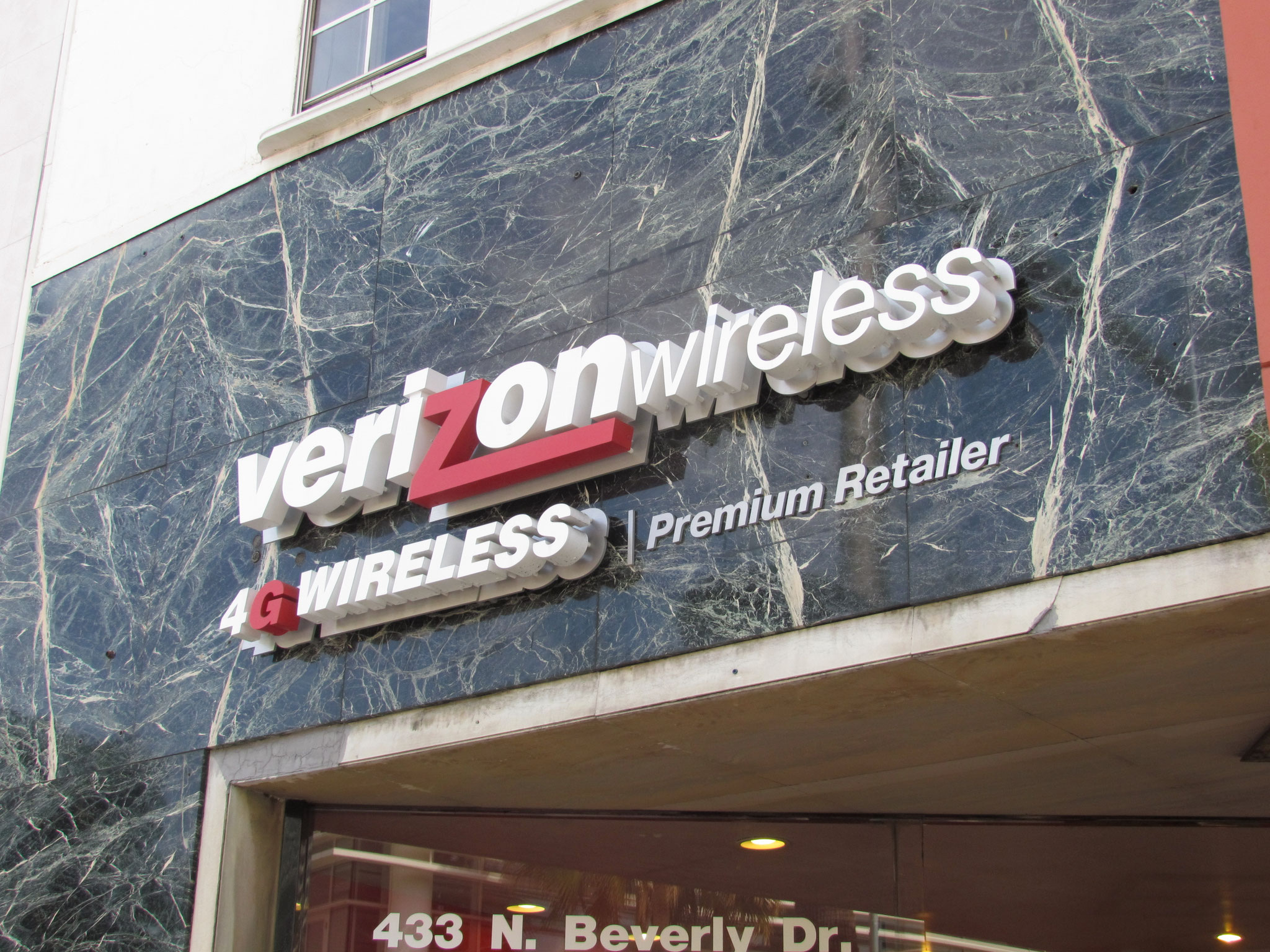
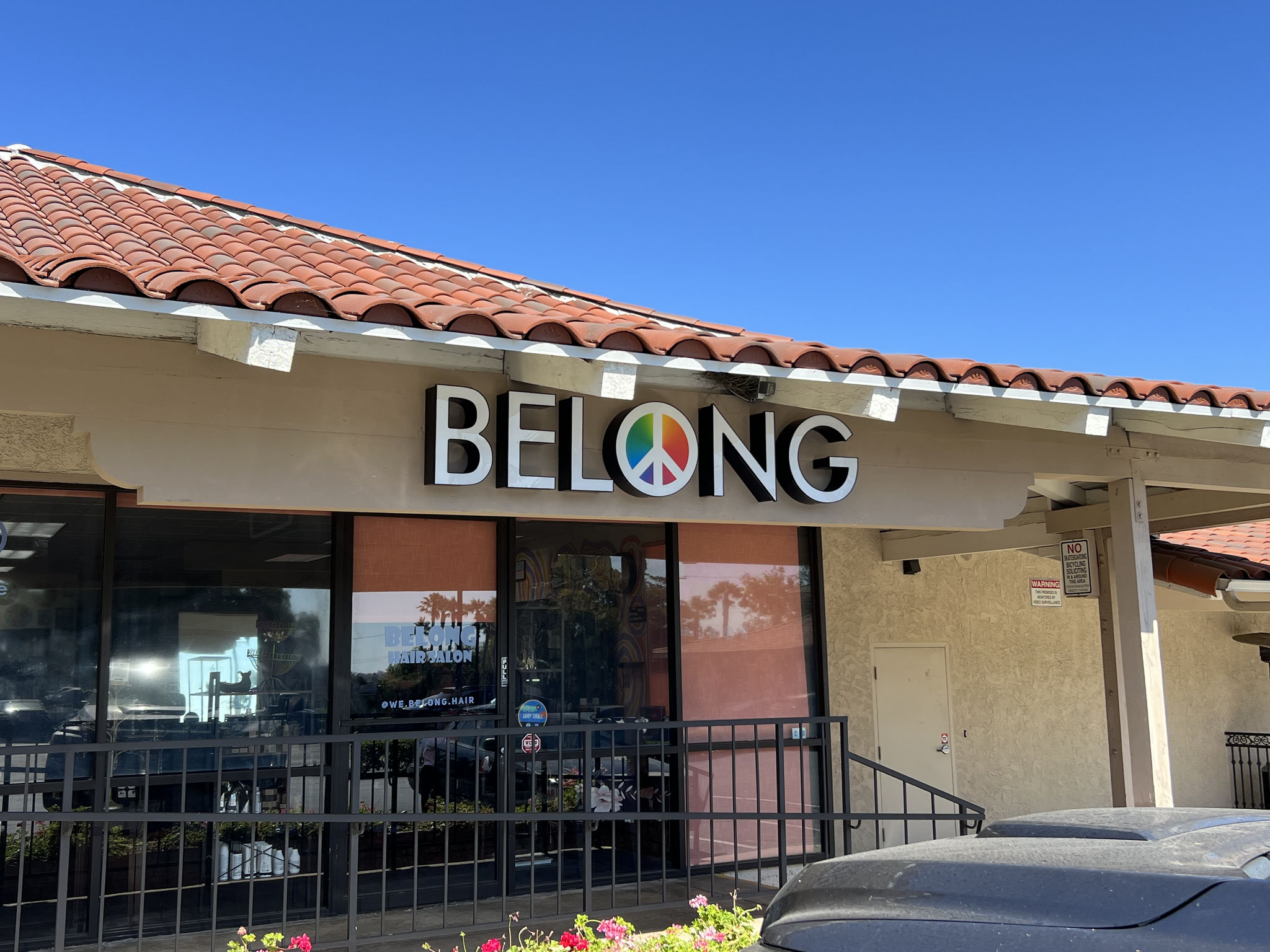
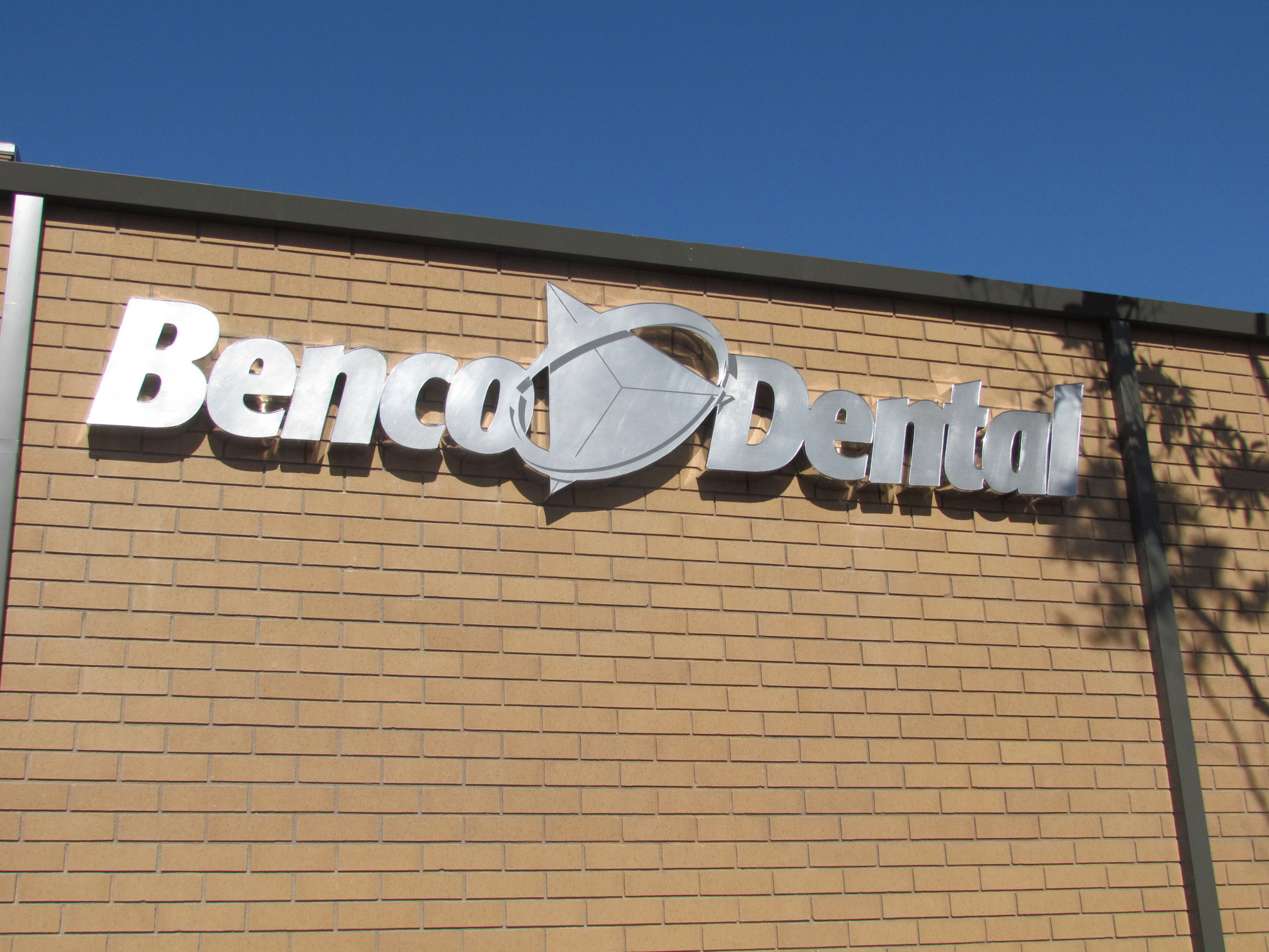
#1 Scale That Matches the Viewing Distance: Scale is one of the most important factors in long-range readability. A sign can feel perfectly proportioned when viewed up close, but once it’s placed on a building, it may not carry enough visual weight. If the lettering is too small for the distance it’s meant to be seen from, it quickly loses impact and becomes part of the background instead of standing apart from it.
#2 Contrast That Holds Up in Real Environments: Contrast isn’t just about choosing light versus dark—it’s about how those choices behave in outdoor conditions. A color combination that looks bold in a controlled setting can flatten out when placed against sun, shadow, glass, or textured facades. Strong distance readability depends on ensuring the letters consistently separate from the building behind them.
#3 Lighting That Maintains Clarity, Not Just Glow: Illumination can make or break a channel letter sign at night. From a distance, what matters isn’t just that the sign is lit, but whether that light creates clear, readable shapes. Overly soft or uneven lighting can blur the letterforms together, while well-balanced illumination keeps each character distinct and easy to recognize.
#4 Letter Spacing That Supports Readability: Spacing between letters becomes more important the farther away a sign is viewed. Tight spacing that feels sleek up close can start to merge visually at a distance, reducing clarity. Proper spacing ensures each letter is individually readable while still feeling cohesive as a whole word or brand name.
#5 Typeface Choices That Scale Cleanly: Not all fonts are designed for distance. Highly stylized or intricate typefaces can lose definition when scaled up or viewed from far away. Simpler, more open letterforms tend to perform better because they retain their structure and readability even when visual detail is reduced by distance.
A Channel Letter Sign succeeds or fails long before anyone is standing right in front of it. Scale, contrast, lighting, spacing, and typography all work together to determine whether a sign is truly effective in the environment it lives in. When those elements are designed with distance in mind, the result is a sign that doesn’t just look good—it communicates clearly from anywhere it’s seen.

Channel Letter Signs by Landmark Signs


An Installed vs a Working Channel Letter Sign

One of the simplest ways to think about this is the difference between a sign that’s merely installed and a sign that’s actually working.
An installed sign meets the basic expectation. It’s physically up, it’s mounted correctly, and from a close distance it usually looks fine. Everything appears “done.” The letters are in place, the lighting turns on, and it technically checks the box for visibility.
But that’s only part of the job.
A working sign goes beyond being present. It performs in real conditions. It’s designed to be read at speed, from distance, in changing light, and in motion. It doesn’t rely on someone standing still and studying it—it communicates instantly, the way a sign is supposed to.
The difference between the two often disappears when you’re standing right in front of the building. Everything can look acceptable up close. But the moment you step back, or see it from the road, the gap becomes obvious. One blends into the environment. The other leads your eye immediately to the business.
What Quality Channel Letter Signs Do Differently
Channel Letter Signs that truly perform aren’t designed around fabrication convenience or just visual appearance on a wall. They’re designed around how people actually experience them in motion and at a distance.
That starts with understanding scale. The letters need to be large enough and properly spaced so they don’t visually collapse when viewed from across a parking lot or a moving vehicle. If the scale is off, the message gets lost before it’s even read.
It also comes down to contrast and readability. A well-designed sign doesn’t just “match” the building—it separates from it in a controlled way so the message is unmistakable. That means thinking carefully about color relationships, edge definition, and how the sign holds up against different backgrounds throughout the day.
And then there’s clarity under real conditions. A sign might look sharp when everything is still and evenly lit, but real environments aren’t static. Light changes, angles shift, and people are rarely looking straight on. Quality Channel Letter Signs are built to stay legible even when everything around them is working against it.
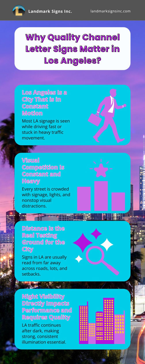
Why do Quality Channel Letter Signs Matter in Los Angeles?
In Los Angeles, signage isn’t competing in a calm visual space, it’s competing in motion, at distance, and at speed. From freeway-adjacent retail to dense commercial strips and wide arterial roads, most signs are seen for only a few seconds while people are moving past at full pace. That makes clarity, lighting, and scale non-negotiable. A Channel Letter Sign either works in that environment or it doesn’t.
1. People Are Almost Always in Motion. In Los Angeles, most people see signage while they’re driving, not walking. They’re moving along the 405, turning off Ventura Blvd, or sitting in stop-and-go traffic on major surface streets. There is rarely a moment where someone is stationary long enough to study a sign. Because of that, a Channel Letter Sign has to communicate instantly at a glance, or it gets missed entirely.
2. Visual Competition Is Constant and Heavy Nearly every commercial street in Los Angeles is visually crowded with competing signage. Storefronts, LED displays, monument signs, banners, and environmental clutter all share the same visual space. Even well-designed signage can get absorbed if it doesn’t have strong contrast and clear presence. In LA, your sign isn’t just trying to look good, it’s trying to stay visible in constant competition.
3. Distance Is the Real Testing Ground. Most signage in Los Angeles is viewed from a distance rather than up close. Drivers see signs across parking lots, multiple lanes of traffic, or from set-back developments off major roads. That distance quickly exposes weak sizing, poor letter spacing, or low readability. A Channel Letter Sign has to be designed to read clearly long before someone is close enough to study it.
4. Night Visibility Directly Impacts Performance. A significant portion of Los Angeles traffic happens after sunset, especially during commuting hours and evening retail activity. As daylight fades, signage becomes one of the primary ways businesses stay visible. If illumination is uneven, dim, or poorly balanced, visibility drops right when traffic remains high. A quality Channel Letter Sign maintains clarity in low-light conditions when recognition matters most.
What’s Different About Channel Letter Signs by Landmark Signs Inc?
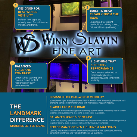
At Landmark Signs, Channel Letter Signs are never treated as simple storefront identifiers, they’re built as real-world communication tools. Every decision starts with how the sign will actually be experienced in motion, at a distance, and within the visual intensity of Los Angeles environments.
Instead of focusing only on how a sign looks up close, the priority is how quickly it can be read, recognized, and remembered from the road.
That’s where designed-for-visibility thinking comes in. Scale, spacing, and contrast are intentionally engineered so the sign performs under real conditions, not controlled ones. Whether someone is driving past on a busy arterial street or passing through a dense commercial center, the goal is instant clarity without effort or second guessing.
Performance is also built into every material and lighting choice. High-quality components are selected to maintain consistency over time, ensuring brightness doesn’t fade and visibility doesn’t drop when conditions change. This combination of structure, design, and illumination creates signage that stays readable across distance, motion, and nighttime environments, exactly where most impressions happen.
Reach out to Landmark Signs Inc to start your project or explore what’s possible for your location.
FOR YOUR OWN CHANNEL LETTER SIGN CALL OR TEXT US AT 714.637.9900.
Need One-on-One Personal Help from Start to Finish? Ask about our low-cost and efficient:

If you are an intrepid, passionate and visionary small businessperson, Landmark has a low-cost program for you!
With our exclusive Entrepreneur's Design & Estimate Service, Landmark will:
- Spend unlimited one-on-one time with you, finding out your needs and educating you about signs.
- Survey your location and its sign needs.
- Thoroughly determine any city or county requirements.
- Produce completely custom sign designs, tailored just for you and your brand. You'll be able to change them as much as you'd like.
- Provide you with a very competitive estimate.
Best of all, when you purchase the final product from Landmark, the fee will be rebated, making it essentially free!
Providing Channel Letter Signs in Los Angeles & Beyond

Channel Letter Signs in Orange County

Channel Letters Signs in Los Angeles

Channel Letter Signs in San Diego

Channel Letter Signs in San Francisco

Channel Letter Signs in Santa Barbara

Channel Letter Signs in Lake Tahoe

Channel Letter Signs in Sierra Counties

Write a comment